Services
![]()
- UI/UX Research
- SEO and Keyword Analysis
- Web and Mobile Design
- User Experience
- Data Visualization
- Responsive Design
- Web and Mobile Development
- Content Creation
The Challenge
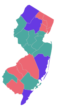
We were tasked with presenting massive amounts of intricate and complex data in a format that would be easily accessible, digestible, and customizable for a wide range of users. These data visualizations needed to be customizable by geography, date, and more than 20 subtopics, including preterm birth, infant mortality, cesarean section rates, and health insurance coverage. Additional layers of customization — race, ethnicity, and maternal age — were also required, totaling more than 60,000 statistical combinations available for free to the public.
County Rates, 2015-2018 Average
PERCENTAGE OF LIVE BIRTHS

Our Analysis

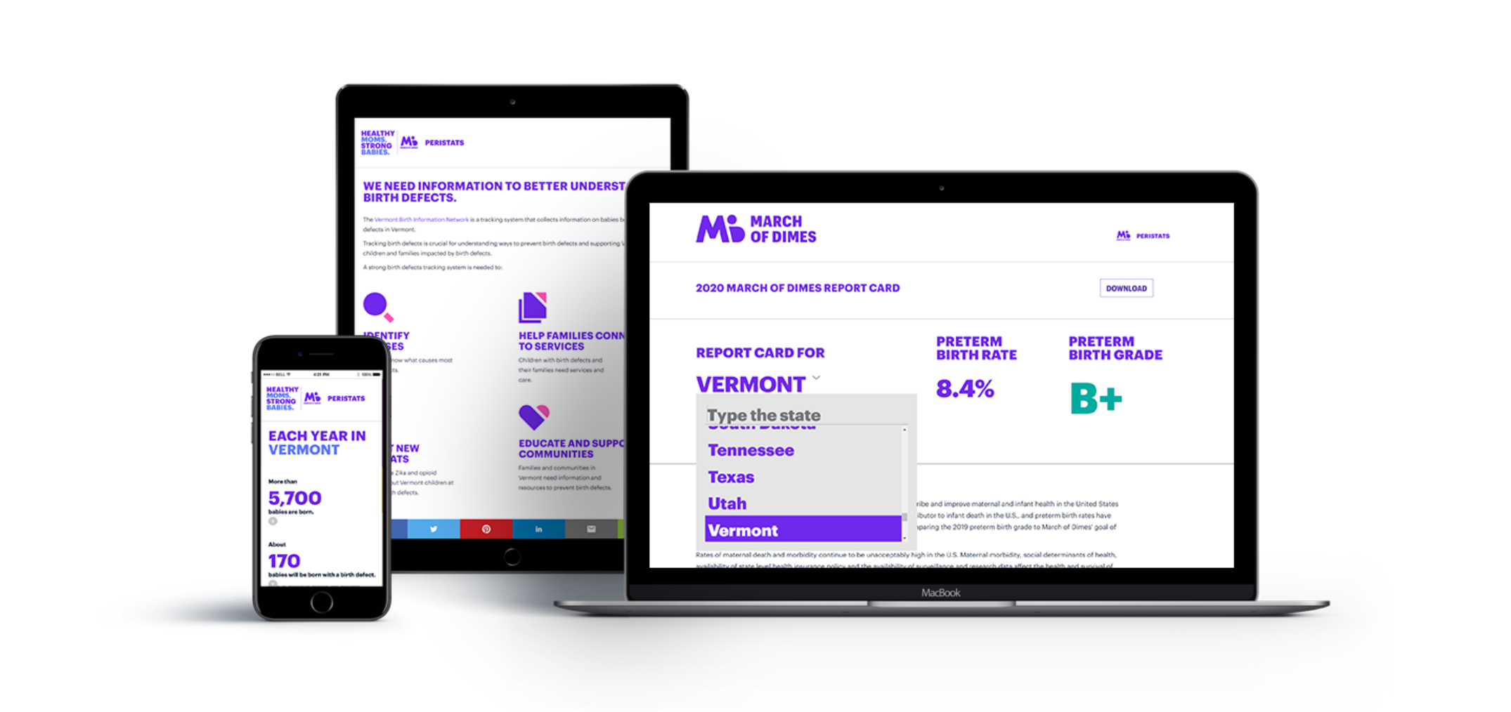
Regardless of the complexity of data involved, the user interface needed to be clean and intuitive, providing an accessible and frustration-free user experience. We mapped out a user journey that would empower users — in part by integrating controls our audience already felt comfortable using. To keep users engaged, our design team implemented visualizations that were concise, consistent, and attractive. The end goal was to provide information in multiple formats for instant access and to inspire sharing, discussion, and action.
Our Solution:
accessibility, accuracy,
and honesty.
Our team paired user experience and data visualization experts with our world-class engineering team, and created a dynamic application that is both engaging and precise. We carefully audited our work with full QA testing each step of the way, ensuring our solution would scale with March of Dimes long into the future.
-
2002
-
2004
-
2006
-
2008
-
2010
-
2012
-
2014
-
2016
-
2018
-
2020
-
2002
-
‘04
-
‘06
-
‘08
-
‘10
-
‘12
-
‘14
-
‘16
-
‘18
-
2020
19 year
collaboration
We first dug deep into the data and the story it was trying to tell. Once visualized, patterns emerged and inspired useful, relevant interpretations. For PeriStats and its audience, this translates into a clean, intuitive interface (i.e., dashboard) that delivers and makes sense of life-changing information for health professionals, researchers, medical librarians, policymakers, students, the media, and of course — families.
Complex Data,
Distilled
PRI has a long history of working with clients to build products and websites that engage their customers through data visualization. In fact, we consider this a specialty of ours: Making sense of and clearly communicating complicated concepts and data, all while standing out from the mass of competing data streams.
Centers for Disease Control and Prevention
National Center for Health Statistics (NCHS) National Center for Chronic Disease Prevention and Health Promotion National Center for HIV, STD and TB Prevention
Centers for Disease Control and Prevention
Health Resources Services Administration
Lorem Ipsum is simply dummy text of the printing and typesetting industry. Lorem Ipsum has been the industry's standard dummy text ever since the 1500s
Health Resources Services Administration
Substance Abuse and Mental Health Services Administration
Lorem Ipsum is simply dummy text of the printing and typesetting industry. Lorem Ipsum has been the industry's standard dummy text ever since the 1500s
Substance Abuse and Mental Health Services Administration

United States Census Bureau
Lorem Ipsum is simply dummy text of the printing and typesetting industry. Lorem Ipsum has been the industry's standard dummy text ever since the 1500s
United States Census Bureau
National Birth Defects Prevention Network
Lorem Ipsum is simply dummy text of the printing and typesetting industry. Lorem Ipsum has been the industry's standard dummy text ever since the 1500s
National Birth Defects Prevention Network
Ready to build something that lasts?


